At a time when institutional galleries struggle ever more for relevance, it is good to see the South Australian gallery struggle and succeed.
The 2014 Adelaide Biennial of Australian Art has much to recommend it. Sex and Death worked for MONA down in Tassie, so with State and National galleries under pressure to catch up, Death is a pretty safe bet for an edgy (but not too edgy for a State Gallery) theme.
So please – leave your catalogue at home, close your ears to the inevitable gallery guides telling you what you should experience, and walk around with a smile for this clever artwork.
On entry, Julia deVille’s room is a treat, and the cat as Victorian bride/mummy is a particular delight.

There’s a lovely absurdity about the work, and the Victorian separation from reality is marvellous, with its unsettling nuance of Beatrix Potter’s animals-as-people.
Walking on through, Trent Park’s room of vastly enlarged photographs is another highlight.
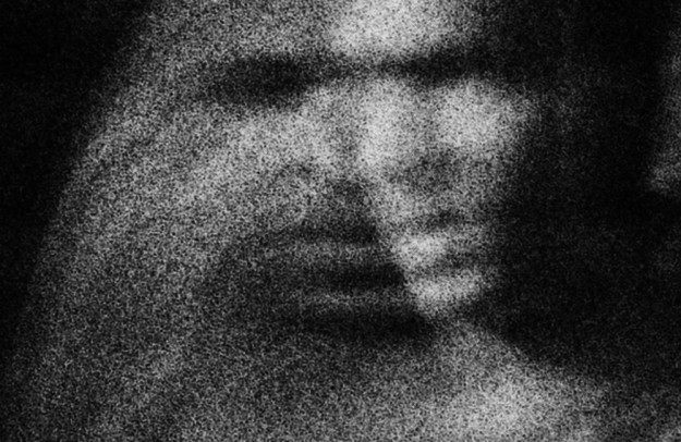
Anyone familiar with Antonioni’s masterwork “Blow-Up” (1966) will get the concept of the film negative enlarged until the grain takes over, but for me this resonates even more in the digital age, when we are increasingly forced to decide for ourselves the point at which the surface ends and the image begins. This is good, successful photography on an institutional scale.
Skip Sally Smart next door and go through to Brook Andrew.
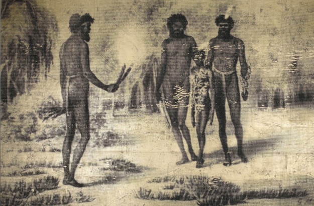
He’s taken early colonial illustrations of indigenous Aussies and screen printed them onto metallic backgrounds. It worked for Andy Warhol and it works for this Andrew. Like Trent Park’s work, the interplay between the surface of the work and the larger image is what makes it intriguing. Go and stick your nose in it.
Then duck back for a break with a bit of good video art.
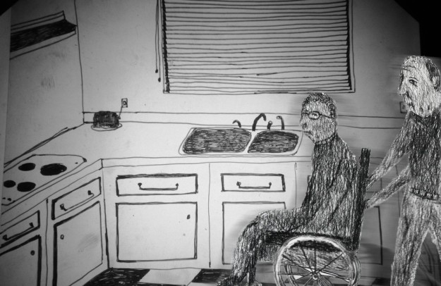
(Yes, I know “good video art” is an oxymoron, but bear with me here) Richard Lewer’s animated piece is great. Simple, warm drawing and faux-simple animation techniques tell the story of a failed suicide pact. Sounds grim, but remember how Romeo and Juliet ended up, and that was a love story too. Maybe it belongs more on YouTube, but its presence here in the gallery pointed out to me how crap the other Video work in the show is. An unintended consequence perhaps, but a happy one.
The Ben Quilty work is a huge disappointment, because it’s huge, and it’s a disappointment.

I’m a big Quilty fan. I love his virtuosic control over thick oil and his brilliant draughtsmanship. I’m glad we have an Art superstar in Oz and I’m glad it’s someone who can actually paint. But this work is a mess. It’s (yes, literally) a Rorschach blob of an island, with all Ben’s beautiful oil paint squished into a drab smear. Maybe that’s a metaphor, but it ain’t satisfying. The room is full of the wonderful smell of raw oil paint though, so it’s still worth spending some time there.
There’s lots of other stuff of course – gosh, 28 artists and I’ve only mentioned a few. It’s free, so go often: I intend to.
Until 11 May 2014
Art Gallery of South Australia
North Terrace
Adelaide
SA 5000

